Who’s Who on Science Twitter and Who Counts?


Remember the Kardashian index? That was Neil Hall’s 2014 tongue-in-cheek(ish) dig at science Twitter and “Science Kardashians” – scientists with a high Twitter-follower-to-citation ratio.
Inspired, Science took a scoop into the massive Twitter ocean and came up “a list of the 50 most followed scientists”, calculating K-indexes for them. After much hue and cry, they returned a few weeks later with “Twitter’s science stars, the sequel”: a bigger crowd – now 100, with a quite different top 50. In between, Euan Adie from Altmetrics weighed in with “The real science stars of Twitter” – the power-sharers of scientific papers.
I remembered that morphing Science list when this came out in the last couple of weeks: “A systematic identification and analysis of scientists on Twitter”, by Qing Ke, Yong-Yeol Ahn, and Cassidy Sugimoto:
Our method can identify scientists across many disciplines, without relying on external bibliographic data, and be easily adapted to identify other stakeholder groups in science.
It got a lot of attention, too. Sarah McQuate picked up these conclusions for Nature a few days ago:
Analysis reveals that female researchers are over-represented on the social media site and that mathematicians and life scientists are less likely to use it.
Those are big claims. You would have to overcome a very high risk of inaccurate detection and selection bias to be able to support them. Ke’s group were after precision: not wanting to find all of Twitter’s scientists, but for the label “scientist” to be right.
It’s a great example of the precision challenge, isn’t it? You want to narrow down precisely on the right group – but you could narrow down somewhere completely, or a bit, off-target so easily.
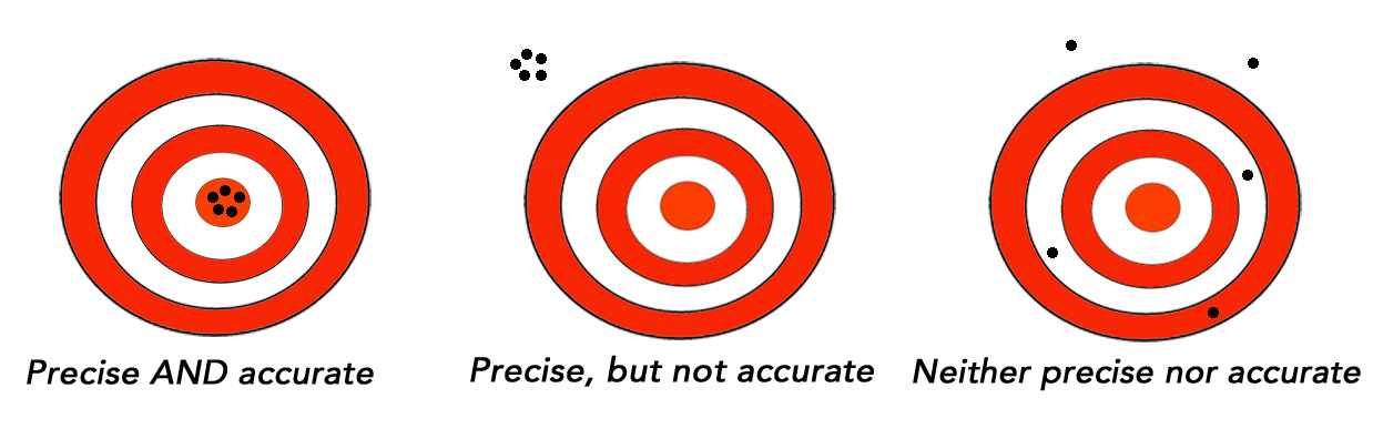
They had an extra challenge because they were also drawing conclusions about “scientists on Twitter”. So precision wasn’t enough to support that: their sample would have to be reasonably representative of the whole population of scientists on Twitter as well.
OK, so what’s the whole population of Twitter, for starters? Ke and colleagues drew a sample of Twitter accounts across a timescale when there were 240 – 271 million active users monthly. (As of June 2016, there were 313 million monthly active users.)
There are also people on Twitter who only “consume” tweets, but don’t post them. There are people who tweet, but not publicly. There are those who tweet, but less than once a month, so it’s not exactly the same accounts active in any given month.
There are people tweeting from more than one account. And then there are the bots and fake accounts: there could be 48 million of those, responsible for between 9 and 15% of all tweets.
Before we dive into the Ke study, and how it approached influential scientists on Twitter, we need some perspective. So let’s look at one Twitter metric for active users: how many “followers” Twitter accounts have.

For that I turned to Adam Dunn. Dunn studies complex networks in clinical evidence and in social media, too. You can read about his great work here. He has studied vaccine conversations on Twitter, and is currently studying information diets and more. With heavy lifting from Paige Newman in Dunn’s team, we took a pragmatic swipe at the question – what data could give us at least a rough idea of the spread of Twitter followers, that was quick to suck out of the Twitter API’s data stream?
The Twitter API pours out a random selection of public tweets. In 2013, there were half a billion tweets a day, and the company hasn’t released a more recent tally of that daily average. The sample that Dunn and Newman pulled across 20-21 April was for number of followers of the accounts sending 4,129,000 tweets. These aren’t necessarily coming from unique accounts – many people tweet many times a day – but the chances of lots of individual tweets being from non-unique people in such a small random subset of a billion is pretty low. I don’t know the proportion of bot accounts: there could be a lot of those.
Most of the accounts – 74% – had 1,000 or fewer followers. Only 5% had more than 10,000 and 1% had over 100,000 followers. And 0.07% had more than a million.
In the table below, the middle percentage on each row shows how many of the accounts had a particular range of followers – with the percentage of accounts below and above that range on either side.
Tweeting accounts in increments of 1,000 to 10,000+ (n = 4,129,000)
| Followers | Percent less | Percent in this range | Percent more |
| Up to 1000 | 0 | 74.1% | 25.9% |
| 1001 to 2000 | 74.1% | 10.6% | 15.3% |
| 2001 to 3000 | 84.7% | 3.9% | 11.4% |
| 3001 to 4000 | 88.6% | 2.0% | 9.3% |
| 4001 to 5000 | 90.6% | 1.3% | 8.1% |
| 5001 to 6000 | 91.7% | 0.9% | 7.2% |
| 6001 to 7000 | 92.6% | 0.6% | 6.6% |
| 7001 to 8000 | 93.2% | 0.5% | 6.1% |
| 8001 to 9000 | 93.7% | 0.4% | 5.7% |
| 9001 to 10000 | 94.1% | 0.4% | 5.3% |
| More than 10000 | 94.5% | 5.3% | 0 |
There are more detailed tables of accounts with less than 1,000 followers and those with more than 10,000 below this post.
Next: what counted as a lot of followers in Science‘s Top 50 and the group of accounts that Ke’s team named? And how much overlap was there? Looking at the differences gives some clue to the selection biases in the Ke method for spotting scientists on Twitter.
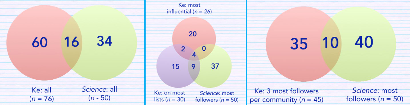
Ke provided 76 names of “top scientists on Twitter”, in their article and their preprint on arXiv, each a member of at least 1 of these 3 groups:
- The most influential by 3 measures (26 Twitter accounts);
- The top 3 with the most followers in each of the 15 biggest “communities” in their sample (for a total of 45); and
- The top 30 measured by who appeared on the most (public) Twitter lists in their data pool.
Twitter lists are curated by people on Twitter: you can subscribe to a public list. For example, “Mathy ladies: Women who tweet about math”, is a list of 245 Twitter accounts curated by mathematician and writer, Evelyn Lamb.
Between Ke’s 76 and Science‘s 50, there are 112 unique scientists – and only 3 people appear in all 4 of the groups (Ke’s 3 groups and Science‘s final top 50): Neil deGrasse Tyson, Richard Dawkins, and Steven Pinker. Here are the overlaps for some of the combinations. (Click on images in this post to see larger versions.) I didn’t include the Altmetric list, but it was extremely different. Adie picked these 3 as “the real science stars of Twitter”: @Neuroskeptic (UK), @yuji_ikegaya (Japan), and @thidakarn (Thailand).
I gathered the number of followers each of the 112 scientists had around 20-21 April – and the number they followed as well. Very few had less than 10,000 followers. Only 23 were women (21%). The single biggest category – by far – was economists (20%). But several differences between the “Ke” and “Science” stood out:
- Every account in the named Ke groups had an English bio – and all but one lived in English-speaking countries, generally the USA. (Only one wasn’t, I think: he was an American living in Mexico.) (In 2013, only half of Twitter’s active users were tweeting in English [PDF].)
- Ke’s named accounts were skewed towards political scientists, historians (8% of the total) and some other categories not on Science‘s list at all – and away from medical scientists. Out of their top 15 communities, none were medical either. (Medical scientists were 14% of Science‘s list, including physician-epidemiologist Ben Goldacre – who came in at number 4 with close to 400K followers.)
- The Ke named accounts included more categories that might typically be practitioners, and a couple of science journalists, too.
To see if this suggests systemic biases in the method Ke and colleagues developed, let’s walk through what they tell us in their article.
To be able to get a large-scale assessment that didn’t rely on something like having published articles, they built on a method described by Naveen Sharma and colleagues [PDF]. It uses the words with which people named and described their lists, as code for the attributes of all the Twitter accounts in the list. If you’re in more than 1 list, you get all the attributes of each of those lists. They made a “Who is who?” service for that, which includes people who are on more than 10 lists, although it’s not clear how up-to-date it is (here).
Sharma’s group was able to categorize 1 million out of 54 million users with this method (1.9%). To test the accuracy, they got people to assess 345 of the million: 18 were judged wrong, for 53 the assessor wasn’t sure, and 274 they judged as accurate (80% of the sample).
Ke and colleagues used the “Who is who?” service. Here’s what they report:
![]()
![]()
![]()
Let’s pause a moment, because those “scientist titles” are critical to the final data.
They started with 2 lists. The first one was the US government’s Standard Occupational Classification. The second was a Wikipedia list of scientists. It’s an ad hoc list. Wikipedia has criteria for featured lists – those that have been through the community’s “peer review” for reliable sourcing, comprehensiveness, and so on: the list of scientist types has not reached that standard. The Ke group took “illustrative examples” from SOC, added the Wikipedia ones, “scientist”, and “researcher”. This gave them 161 “scientist titles” (plus the plural of each). The kind of colloquial synonyms common on Twitter weren’t added – I’m thinking of things like “data nerds” or “STEM women”. There’s only English – specifically, American English. To give you an idea of the imbalance in the 161 titles, 17% were varieties of psychologist.
Based on the skews I mentioned above, I took a different list of scientists to see how it would match up: SKOS. That’s the United Nations Educational, Scientific and Cultural Organization (UNESCO) nomenclature for fields of science and technology. Some contrasts, to make the point:
| In | Out |
| Clinical psychologist | Psychiatrist |
| Genealogist | Geometer |
| Sports psychologist | Physician |
| School psychologist | Cytologist |
| Protohistorian | Cardiologist |
| Ethnoarcheologist | Biometrician |
Let’s pick up again where we left off:
![]()
![]()
In Table 2, the authors compare the percentages in their sample with percentages in the national employment statistics. They found that while 48% of their sample were social scientists, only 21% of the science workforce is:
These results suggest that social scientists and computer and information scientists are over-represented on Twitter, whereas mathematical, life, and physical scientists are under-represented.
I don’t think it suggests that at all: it’s pretty much what you would expect from the selection of those 161 titles. Ke and colleagues note the possibility of bias from their method, but that didn’t come through in the abstract or the Nature report, for example. The paper includes other conclusions, without adequate comparative data. For example, conclusions on gender (with gender for 72% estimated) would need to take into account the spread of disciplines and career age (they looked for words like “student” and “postdoc” in profiles).
They used 3 methods to determine their list of most influential, but I couldn’t find detail or references in the paper for the calculations they used. So I can’t make sense of it. I don’t know, for example, how much follower data influenced the scores. This is a complex and quirky thing. There might be a big difference, for example, in people who have an avid large following, and people whose ranks are swollen by massive mutual follow-back. In Ke’s most influential list, for example, there are a couple with “negative followers” – they follow more than are followed. (One is over 10,000 in the red.)
No rationale was given for trying to exclude accounts with pseudonyms, and I can’t think why you would. I understand why Science did – anyone wanting to tie in citation data needs the name. But otherwise, I can’t see why you would exclude such an important part of science Twitter.
So where does this leave us at this point?
Triangulation of multiple clues might help get us closer to understanding science Twitter, but the selection bias is likely to stay massive – especially given that even if scientists communicate some or all of the time in English with each other, that’s not what Twitter is for. Global Anglo-based data, now that less than half of Twitter is Anglo, is of questionable value.
We know that there are differences in how different scholarly communities use Twitter [PDF]. There’s a 2014 estimate that only 13% of scientists are on Twitter. But they are only a part of what science Twitter is all about, as Adie points out. We still don’t know all that much, qualitatively, about research impact from Twitter [PDF]. That matters.
I think there’s a base in the Ke study from which you could potentially get a partial handle on people in science-based professions on Twitter. But getting a handle on “scientists” is probably elusive.
~~~~
You can see the data underlying this post in this Google sheet. If you see any mistakes, I would appreciate hearing about them – in a comment here, to me on Twitter, or by email (my Twitter name at gmail). I have also commented on PubMed Commons.
A giant thanks to Adam Dunn and Paige Newman for helping out with the data on Twitter followers: all mistakes in analyses or interpretation of the data are mine, though.
I’m also grateful to Jonathan Eisen – or to use his “Kardashian” name, @phylogenomics. His ongoing vigilance of #badomics words raised my awareness and inspired the cartoon that leads this post. (Although I was disappointed to find out that yes, twitteromics is a “thing”.)
The cartoons are my own (CC-NC-ND-SA license). (More cartoons at Statistically Funny and on Tumblr.)
Correction on 29 April: The first version had historians as 13% of the sample in one mention, and 8% in the other – 8% is the correct one.
Data on number of followers of a random sample of Twitter accounts that tweeted 20-21 April 2017. Minor differences in percentage totals occur because of rounding. (Back to top)
Table 1. Tweeting accounts with up to 1,000 followers (n = 3,060,283; 74% of 4,129,000)
| Followers | Percent less | Percent in this range | Percent more |
| Up to 100 | 0 | 25.5% | 74.5% |
| 101 to 200 | 25.5% | 12.4% | 62.1% |
| 201 to 300 | 37.9% | 9.1% | 53.0% |
| 301 to 400 | 47.0% | 6.9% | 46.1% |
| 401 to 500 | 53.9% | 5.4% | 40.7% |
| 501 to 600 | 59.3% | 4.3% | 36.4% |
| 601 to 700 | 63.6% | 3.5% | 32.9% |
| 701 to 800 | 67.1% | 2.8% | 30.1% |
| 801 to 900 | 69.9% | 2.3% | 27.8% |
| 901 to 1000 | 72.2% | 1.9% | 25.9% |
Table 2. Tweeting accounts in increments of 1,000 to 10,000+ (n = 4,129,000)
| Followers | Percent less | Percent in this range | Percent more |
| Up to 1000 | 0 | 74.1% | 25.9% |
| 1001 to 2000 | 74.1% | 10.6% | 15.3% |
| 2001 to 3000 | 84.7% | 3.9% | 11.4% |
| 3001 to 4000 | 88.6% | 2.0% | 9.3% |
| 4001 to 5000 | 90.6% | 1.3% | 8.1% |
| 5001 to 6000 | 91.7% | 0.9% | 7.2% |
| 6001 to 7000 | 92.6% | 0.6% | 6.6% |
| 7001 to 8000 | 93.2% | 0.5% | 6.1% |
| 8001 to 9000 | 93.7% | 0.4% | 5.7% |
| 9001 to 10000 | 94.1% | 0.4% | 5.3% |
| More than 10000 | 94.5% | 5.3% | 0 |
Table 3. Tweeting accounts with over 10,000 followers (n = 218,576; 5% of 4,129,000)
| Followers | Percent less | Percent in this range | Percent more |
| 10,001 to 20K | 94.7% | 2.1% | 3.2% |
| 20,001 to 30K | 96.8% | 0.9% | 2.3% |
| 30,001 to 40K | 97.7% | 0.5% | 1.8% |
| 40,001 to 50K | 98.2% | 0.3% | 1.5% |
| 50,001 to 60K | 98.5% | 0.2% | 1.3% |
| 60,001 to 70K | 98.7% | 0.2% | 1.2% |
| 70,001 to 80K | 98.8% | 0.1% | 1.0% |
| 80,001 to 90K | 98.9% | 0.1% | 1.0% |
| 80,001 to 90K | 99.0% | 0.1% | 1.0% |
| 90,001 to 100K | 99.0% | 0.1% | 0.9% |
| More than 100K | 99.1% | 0.9% | 0 |
* The thoughts Hilda Bastian expresses here at Absolutely Maybe are personal, and do not necessarily reflect the views of the National Institutes of Health or the U.S. Department of Health and Human Services.